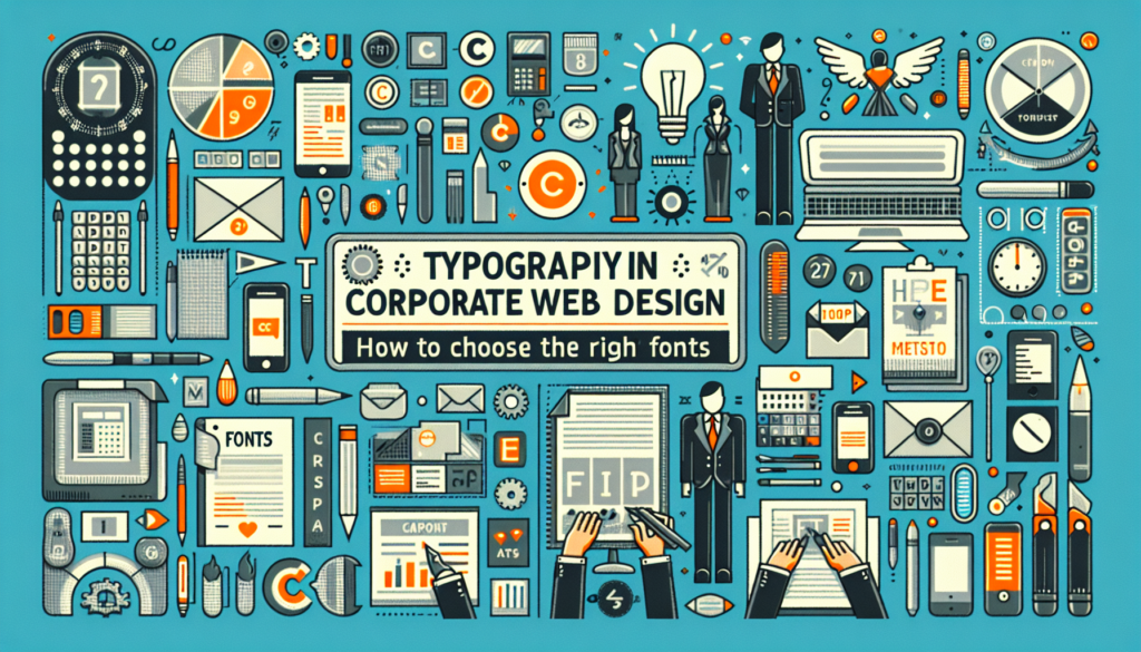
Immersed in the digital age, the visual presentation of web content has become a key piece for corporate identity. The choice of typography not only contributes to the overall aesthetic appearance of a website but also plays a fundamental role in readability, usability, and accessibility. In this context, a technical analysis on the appropriate selection of typographic fonts emerges as a critical component that directly influences brand perception and user experience.
Typographic Principles and Readability
The selection of typography should be guided by criteria of readability and suitability to the brand’s message. Cognitive studies in the psychology of perception have shown that certain fonts facilitate reading comprehension, while others can hinder it. Serif fonts, with their design featuring small strokes or extensions at the ends of the letters, are traditionally associated with seriousness and classic style, and are considered highly readable in print format. However, on screens with limited resolution, sans-serif fonts, characterized by their lack of embellishments, can improve clarity and reading speed due to their simplicity of forms.
Technical Considerations
At the technical level, the performance of typography on the web involves considering several aspects such as loading speed, compatibility between browsers and devices, and the impact on content accessibility times. The implementation of web fonts through services like Google Fonts or Adobe Fonts allows access to a wide library of options with guaranteed cross-platform compatibility and optimized performance in terms of loading. Moreover, the use of the CSS property font-display allows controlling the loading behavior of fonts, enabling strategies like swap or fallback to improve the user experience in case of delay in loading the main typography.
Impact on Brand Identity
Visual coherence between the logo, color palette, and typography forms the tripod upon which a brand’s identity is sustained. Choosing typography aligned with the values and personality of the brand can enhance its recognition and differentiation in the market. For example, a company aiming to convey modernity and minimalism might opt for a clean-lined sans-serif font, while a legal firm with a long history might lean toward a serif font that communicates tradition and solidity.
Integration with Design Tools
Advances in web design tools make features like variable fonts available to designers, which allow dynamic adjustment of properties such as weight or width of fonts. This flexibility enables greater customization and adaptability of typographic design to different contexts and screen resolutions. The use of design software like Sketch or Adobe XD integrated with web specifications results in a symbiosis between prototyping and the final implementation on the website.
Accessibility and Compliance with Regulations
It is essential to consider typographic accessibility to ensure that content is legible for all users, including those with visual disabilities. The Web Content Accessibility Guidelines (WCAG) provide recommendations on text size, contrast, and visual hierarchy. Adhering to these guidelines is not only an ethical matter but can also be a legal requirement in many jurisdictions, preventing the unintentional exclusion of significant parts of the population.
Case Study Examples
Case studies, like the restructuring of Airbnb’s visual identity and its choice of a custom typography, illustrate how the integration of typography into branding strategy can revitalize a company’s image. Airbnb opted to create its own font, “Airbnb Cereal,” to enhance visual cohesion and communicate its values of belonging and connection through a unique and recognizable typography.
Innovations and Future Directions
Looking forward, the intersection between typography and technology continues to expand. The emerging field of variable typography offers the promise of fonts that dynamically adapt to a range of conditions, such as response to user context or the device used for viewing. This could mean a step forward in personalization and improving the user experience on corporate websites.
In conclusion, the decision on which typography to incorporate into a corporate website transcends aesthetic design to embrace factors of functionality, accessibility, and brand expression. A deep mastery of typographic principles, integration with modern design tools, and a commitment to accessibility are indispensable for creating user experiences that are not only visually attractive but also inclusive and representative of corporate values. This holistic approach is what will determine the effectiveness of visual communication in today’s competitive digital environment.