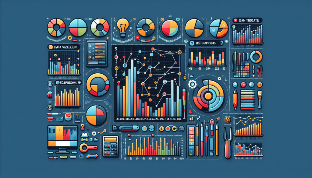
In a data-driven world, turning complex numbers into clear and effective visuals is essential for analysis, understanding, and decision-making. Data visualization tools play a crucial role in this process, enabling users to transform datasets into charts, maps, and other graphical forms that facilitate interpretation. This article explores five of the most advanced data visualization tools and how they are revolutionizing analytical storytelling.
Tableau: Leader in Interactive Analytics
Tableau has stood out in the market thanks to its user-friendly interface and advanced interactivity. Backed by powerful data handling capabilities, it supports multiple sources and allows the combination of datasets for more comprehensive insights. The VizQL feature converts queries into visualizations with impressive ease, simplifying exploratory analysis. Tableau also supports the creation of dynamic dashboards and storytelling, becoming a popular choice among companies needing to share insights with a variety of stakeholders.
Practical Applications:
- Business Analysis: Tableau is commonly used to generate interactive reports that allow executives to make decisions based on visual trends and predictions.
- Big Data Visualization: Its ability to handle large volumes of data makes it a key tool for big data interpretation.
Comparison and Evolution:
Compared with its predecessors, Tableau has democratized data analysis by offering a tool that does not require programming skills. Its continuous development incorporates trends such as artificial intelligence and machine learning to enhance the user’s analytical capability.
QlikView & Qlik Sense: Associative Data Exploration
Qlik offers two main products: QlikView and Qlik Sense. Both utilize Qlik’s associative analytical engine which highlights relationships within data, revealing hidden insights. While QlikView focuses on the creation of guided visualization applications, Qlik Sense empowers users with a more intuitive interface and self-service BI capabilities.
Practical Applications:
- Financial Sector: They use Qlik to handle real-time market data and perform risk analysis.
- Supply Chain Management: Applications to optimize inventory and logistics based on data visualization.
Comparison and Evolution:
The transition from QlikView to Qlik Sense exemplifies the shift towards self-exploration of data. Unlike other tools, Qlik focuses on in situ data exploration, allowing users to delve into and query data directly from the visualizations.
Power BI: Integration with the Microsoft Ecosystem
Power BI is a suite of business analytics tools from Microsoft that offers robust integration with other Microsoft applications. Its strength lies in the Power BI Service, a cloud service that centralizes data management and facilitates collaboration. Another key feature is Power Query, a powerful data manipulation tool that adds to its versatility.
Practical Applications:
- Corporate Reporting: Power BI simplifies the process of gathering data from different departments and creating informative dashboards.
- Office 365 Integration: Organizations that already rely on Microsoft products benefit from the synergy with Power BI.
Comparison and Evolution:
Compared to other tools, Power BI has gained ground for its familiarity among users of Microsoft products and its integration with Azure. It constantly evolves to improve integration with Big Data systems and AI services.
Plotly: Power and Customization for Developers
Plotly stands out by offering an advanced and detailed charting library for developers who seek to customize their visualizations to the utmost. Built on D3.js, which in turn is one of the most flexible and powerful JavaScript libraries for creating web graphics, Plotly enables collaboration on projects and can produce fully interactive visualizations.
Practical Applications:
- Data Science: Researchers and data scientists use Plotly to create advanced scientific visualizations that are easily publishable on the web.
- Engineering: Visualizing results from complex simulations or real-time sensor data.
Comparison and Evolution:
In contrast to other tools, Plotly is more oriented toward users with programming experience. Its customization capability has continued to grow, coming even close to the level of control offered by programming from scratch in D3.js.
Sisense: Linking BI with the Internet of Things (IoT)
Sisense is designed to simplify complex data processes and make business intelligence accessible. It provides a complete platform ranging from data integration to interactive collaboration on dashboards. One of its most notable innovations is its ability to work with IoT data and provide real-time insights.
Practical Applications:
- IoT: Integration with IoT devices for the analysis of data generated by sensors across multiple industries.
- Analytics-Driven Culture: Promoting a data-driven corporate culture through the accessibility to complex analyses.
Comparison and Evolution:
Sisense stands out for its focus on processing performance and its ability to handle high-speed data from IoT devices. Its continued development suggests a future focus on democratizing advanced analytics.
These data visualization tools are exemplary in the way they deal with complexity and the increasing volume of data. As they evolve, they integrate techniques such as artificial intelligence and in-memory analysis to provide faster, deeper insights. The right tool choice will depend on the specific needs of each company and the technical prowess of its users. On the horizon, innovations will undoubtedly continue to transform data visualization and analysis.